


When I switched careers into UI design in my early forties, I quickly realized that technical skills alone were not enough. Finding examples, patterns, and practices that work in other apps is just as important when building a strong knowledge base. Since then, I have made it a habit to test different self-learning apps on Android – partly for personal growth, and partly because I genuinely enjoy analyzing the user experience (UX) of tools that help people learn.
Recently, while exploring the crowded market of self-improvement apps, I came across RiseGuide.
Instead of massive online courses that often remain unfinished, the RiseGuide app focuses on microlearning – short lessons built around expert insights and daily learning habits.
The premise immediately caught my attention. Could an app effectively distill complex concepts into bite-sized, mobile-first experiences without losing value?
This RiseGuide review is based on several weeks of hands-on testing on an Android device. I explored its lessons, interactive tools, and daily learning features to understand not just if it works for steady progress, but from a design perspective, how its mechanisms make that progress possible.
What Is the RiseGuide App?
RiseGuide is a mobile learning platform focused on microlearning and personal development. Instead of long courses, the app delivers short daily lessons built around expert insights in areas such as communication, confidence, productivity, and personal branding.
The goal of the RiseGuide app is to help users build learning habits and gradually improve skills through structured learning journeys.
RiseGuide App UI and Navigation: A Design Perspective
As someone who moved into UI design a few years ago, I evaluate learning apps through a specific lens – how well does the interface support the cognitive process of learning? Many educational apps contain fantastic material but fail in their delivery, overwhelming users with cluttered dashboards. The RiseGuide app clearly attempts to solve this by designing its interface around short, frictionless sessions.
The Power of Visual Focus
The first thing that stands out is the app’s visual hierarchy. Instead of text-heavy menus, RiseGuide uses a clean, card-based layout. The learning journeys are presented as visual paths that guide users step by step, removing the guesswork of “what should I click next?”
When you open a learning module, the structure relies on progressive disclosure. You are not hit with dozens of tasks at once. Lessons, exercises, and follow-up actions appear in a clear sequence.
For example, in the Communication module, the user flow looks like this:
- The Concept – the journey begins with a core lesson.
- The Application – the lesson has advice, tools, and quizzes for practice.
- The Reflection – a quick check of additional answers from the experts.
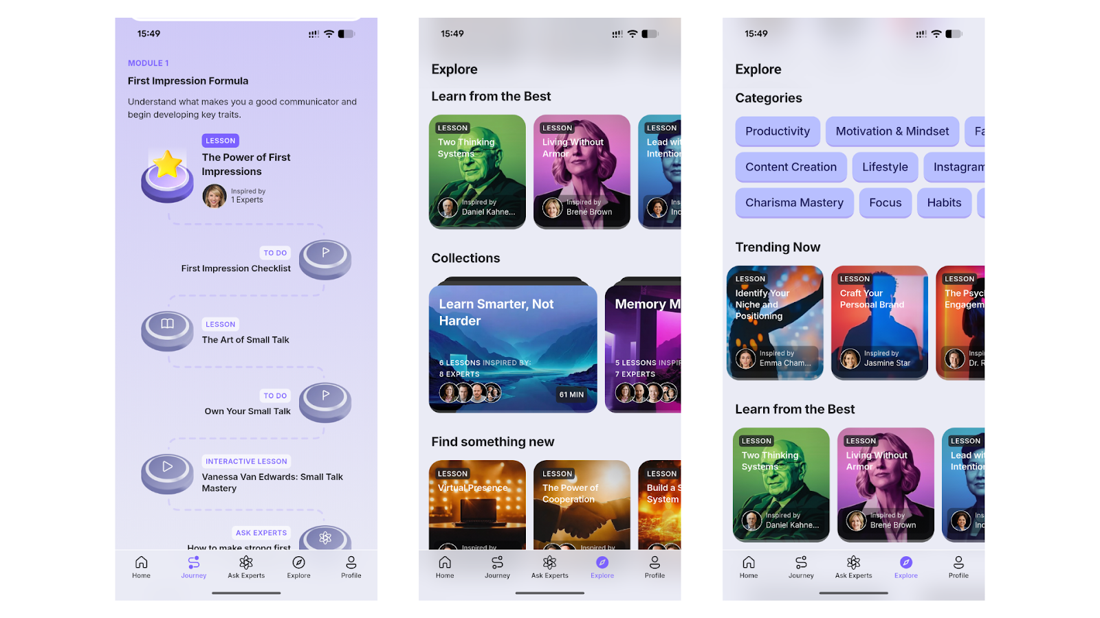
From a UI perspective, this linear visual progression reduces cognitive load. The interface naturally leads users to the next step, which increases the likelihood that they actually finish lessons.
Thumb-Friendly Navigation
Another effective design detail is the bottom navigation bar. It is clearly labeled with recognizable intuitive icons: Home, Journey, Ask Experts, Explore, and Profile.
For a mobile learning platform, this architecture matters. Most learning sessions happen during short breaks – commuting, waiting in line, or between tasks. The navigation allows you to open the app, complete a quick lesson, and leave without digging through menus.
Interactive Learning Flow and Visual Structure
A common challenge for mobile learning apps is fragmentation – when reading, watching, and doing, they feel disconnected. As I can see, RiseGuide handles this quite well.
Lessons alternate between explanation and action. For instance, after introducing a concept about first impressions, the app immediately suggests a First Impression Checklist. This turns a theoretical idea into something users can apply immediately.
To guide the user through these steps, the interface relies on several visual cues:
- Distinct icons
- Good action buttons
- Progress indicators
Combined with consistent spacing and simple typography, these details make the interface easy to scan. Even when multiple elements appear on screen, the structure remains clear.
Exploring Content and Expert Insights
For users who prefer self-directed learning, the Explore section offers a different experience from the structured learning paths.
Instead of presenting long lists of courses, RiseGuide uses visual content cards that highlight the topic, expert inspiration, and learning focus.
Topics are grouped into categories such as Productivity, Mindset, Habits, Communication, and Content Creation. This makes browsing the app feel closer to exploring a curated knowledge library than enrolling in a traditional course.
The platform also highlights lessons inspired by well-known experts in fields like entrepreneurship, behavioral psychology, and leadership. Rather than replicating full books or lectures, the app extracts practical insights that can be applied quickly.
The SEEK Interface: On-Demand Knowledge
One of the more interesting parts of the RiseGuide app review process was testing the SEEK section.
Instead of a traditional FAQ, this area functions as a question-based knowledge search tool.
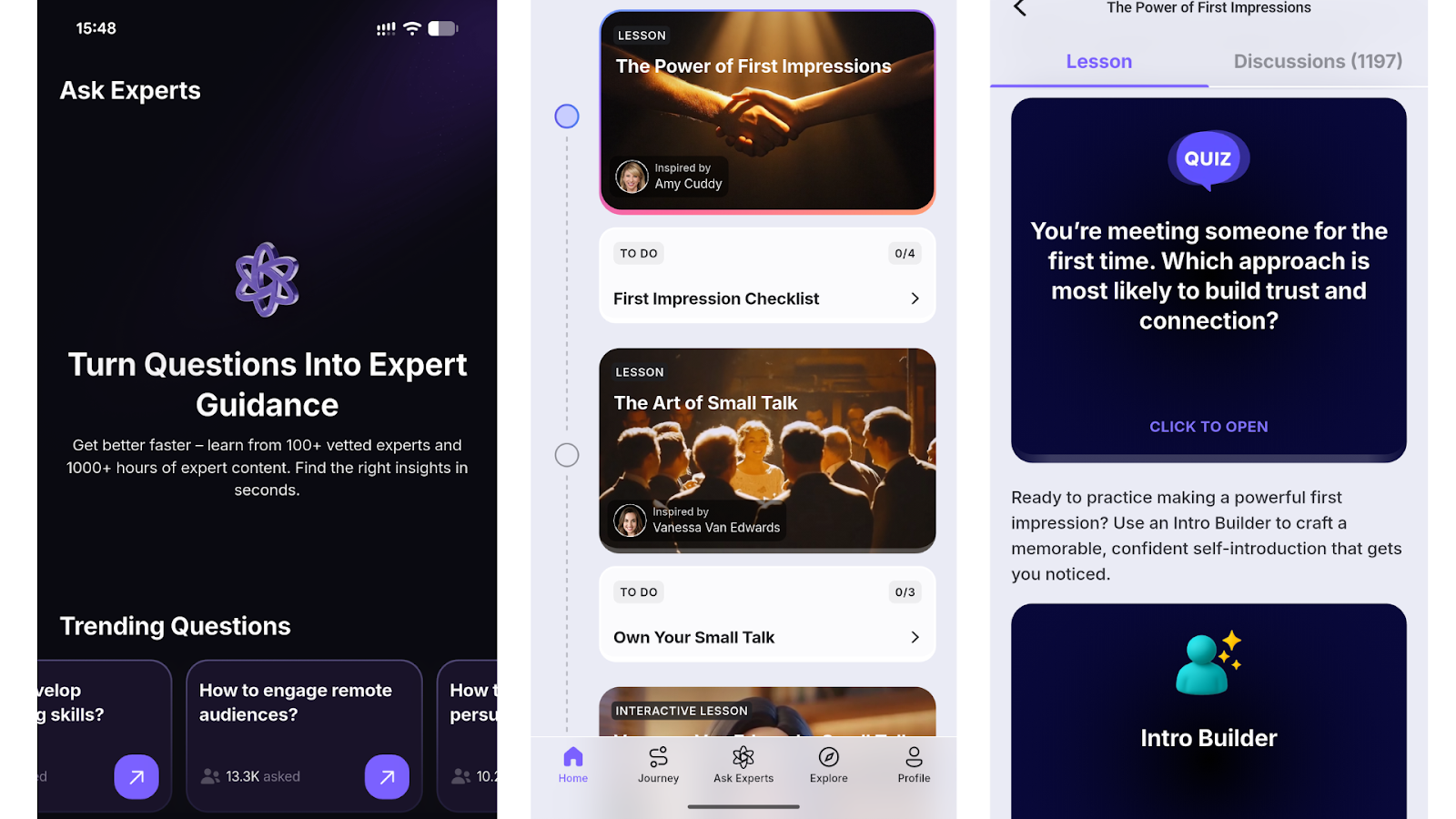
The interface here is intentionally minimal:
- Trending questions appear as large, tappable cards
- Search input is placed front and center
- Minimal distractions keep attention on the query
- Familiar video player design makes it easier to watch useful content
This feature adds flexibility to the learning experience. Instead of following only predefined learning journeys, users can search for specific topics and access expert-backed insights immediately.
Limitations of the RiseGuide App
After testing the platform as part of this RiseGuide app review, several strengths and a few limitations became clear.
Potential limitations
- Most content is currently in English, which may limit accessibility for some users
- Lessons focus on short insights rather than deep academic knowledge
- The platform is mobile-only, so desktop learners may prefer other formats
As I see it, RiseGuide prioritizes practical daily learning on-the-go rather than large, structured academic programs.
Does RiseGuide Work? My Experience After Several Weeks
After using the RiseGuide app for a few weeks, the main advantage became clear – it fits easily into short daily routines. Most learning apps assume users will dedicate long study sessions, but RiseGuide is built around microlearning.
Lessons usually take around 10–15 minutes and are organized into structured journeys. For example, in the First Impression Formula module, the app breaks communication skills into small steps – a short lesson, a checklist, and a quick exercise.
This structure makes it easier to stay consistent. Instead of jumping between random resources, the RiseGuide app guides you through a clear path while still allowing flexibility through the Explore section. Overall, the format works well for users who want steady self-development in small daily sessions.
To sum up, these things were an ideal match for me:
- Clear mobile-first design
- Structured learning journeys – lessons build on each other, not in a random order
- Short daily lessons help maintain a consistent learning habit
- Visual UI clarity with card layouts and progress paths
- Multiple learning formats – lessons combine reading, video, exercises, and checklists
RiseGuide Cost and Subscription Model
The RiseGuide cost depends on the subscription plan and available promotions at the moment, as well as your geography and local taxes. The platform typically has an introductory offer for $19.99/month and renews at a regular price that’s in the $39-$49 range.
New users often receive a reduced introductory price for the first billing period, as I did. This allowed me to explore the lessons before continuing at the standard subscription rate. After the initial period ends, the plan is renewed at the regular price, which can vary depending on your selected plan and region.
Although there is no traditional free trial, the introductory pricing allowed me to do my test on the app and see whether the learning format fits my goals and looks promising.
Final Verdict
Overall, the RiseGuide app appears carefully designed around mobile learning behavior. The visual hierarchy, card-based layouts, and straightforward navigation make it easy to engage with lessons without feeling overwhelmed.
From a design perspective, the app does a good job balancing clarity and functionality. For Android users interested in self-improvement apps that emphasize short lessons and steady progress, RiseGuide offers a structured and well-designed learning environment.