


Google promised a visual refresh inspired by its new Material 3 Expressive design language. The company made it clear that the update laid the groundwork for more personalized system when it announced Android 16. But when the stable release dropped for Pixel phones days ago, the makeover itself was missing.
Courtesy of Android Authority, we caught a glimpse of what to expect in an APK teardown earlier this month. Now, Beta users of the Google Phone app are starting to see it as it rolls out on the Google Phone app.
Material 3 Expressive makeover coming to Google Phone app
Leaks of the in-call screen on the Google Phone app have previously exposed how it has been transformed. The older UI had a tight and rigid appearance where everything sat close together. The buttons were small and flat, and the overall layout felt dense.
In the new UI, the appearance is softer with more breathing room between elements. Buttons are pill-shaped and noticeably larger, making them easier to see and press. Also, they're not sitting flat against the background. They appear to float slightly, with shadows and bold icons that feel more tactile.
Even caller information has been rethought. The old UI places contact names and photos in smaller areas with less emphasis. Contacts' name are in a larger font and positioned more prominently, with the photo surrounded by a subtle glow that gives the whole screen a friendlier and more personal feel.
Google is now officially releasing the Material 3 Expressive redesign of its Phone app gradually, beginning with a limited rollout through server-side activation in version 180.0.771769344 of the beta channel. Instead of pushing it through a traditional app update where everyone receives it at once, they're selectively enabling the overhaul from their end through codes already embedded in the app.
Related: Android 16: Everything That’s New On Google’s Latest Software
Slide or tap to answer your calls
Google is also updating the Phone app with a new feature called “Incoming call gesture” where you receive more control over how you answer calls. This setting lets you choose between two interface types for the incoming call screen, both of which are part of the ongoing Material 3 Expressive refresh.

One of these new options is the “Single tap” gesture. Instead of the usual swipe-to-answer interface that Android has used for years, this new layout simply places large, clearly labeled “Answer” and “Decline” buttons on the screen and you’ll tap the button you want.
Personally, I’d stick with the singular buttons. I really just want to answer my calls on most days and not fumble with flashy gestures, especially when I'm holding multiple things.
Are you team Material 3 Expressive or not?
Fans are split over Google's Material 3 Expressive redesign. On one hand, some people are excited to see that the phone brand is finally moving past the muted pastels and minimalism that defined earlier versions of Material You.
I never had a problem with it, and it's frankly what attracted me to the phones. On the other hand, some argue that the expressive design feels bloated, impractical, and feels like a unicorn did its business on the interface. But, of course, it's easy for someone who hasn't used Pixel phones for long to say.
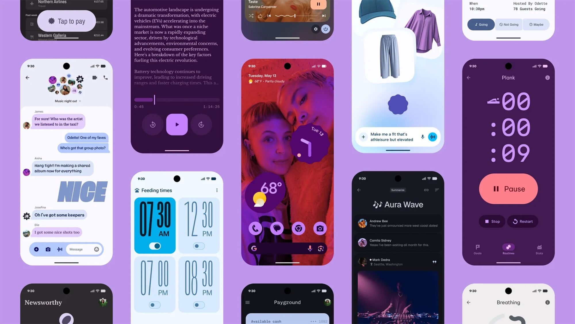
It's not entirely wrong. The most immediate thing that stands out is the intense use of color in Google's marketing. You'll see deep purples, hot pinks, lavender, coral, and saturated gradients dominate the screen.
Fonts are also huge, playful, and deliberately stylized. There's a mix of bold display text with subtle body text, although some fonts appear more experimental and chosen for poster art rather than a traditional interface. Again, there are rounded shapes everywhere and generous white space.

