


The Pop-Up Problem That Annoyed Drivers
For years, whenever an alert for an accident or radar appeared on Android Auto, users felt Google Maps was undermining its own usefulness. The culprit was a confirmation pop-up that took over a large part of the screen, sometimes at the worst moment in the drive. If you were about to take an exit, the window could block your next instruction. That flaw has now been corrected, no longer spoiling trips with awkward interruptions.
Waze-Style Reports Had Integration Issues
Since 2024, Google Maps on Android Auto introduced Waze’s community-sourced incident reporting for accidents, road debris, stopped vehicles, or police checks. While a helpful idea, the interface’s execution was lacking: those reports sometimes covered your next turn or the estimated time of arrival (ETA). Now, the new layout keeps all critical info visible and accessible, just as drivers need.
No More Disruptive Pop-Up—A Slim Banner Instead
In the previous version, whenever a driver reported an incident, Google Maps would launch a large window in the center of the display asking if the problem was still present. For several seconds, this card replaced key navigation details—you had to either wait for it to disappear or manually close it, which no one wants to do while driving.
With the update rolling out since 2024, the pop-up has been replaced by a small banner appearing above the ETA. The “Yes” and “No” buttons remain for confirmation, but the banner no longer blocks essential navigation areas. The directions stay visible at all times.
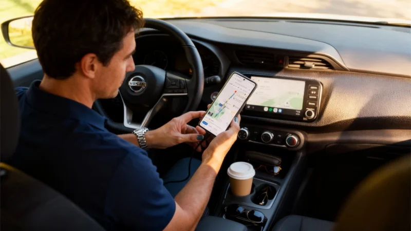
Navigation Info Remains Stable—And So Do Your Eyes
In practice, the interface now looks a little denser during the banner display, but nothing shifts: the map and route instructions remain static, and your next maneuver and its distance stay on screen. This improvement is especially helpful on widescreen or compact displays in modern cars, where previous pop-ups often covered or displaced essential route info. Now, everything stays anchored in place.
This stability reduces distractions and cognitive fatigue—there's no need for your eyes to track moving interface elements right at complicated junctions or exits. If you ignore the confirmation request, the banner vanishes automatically after a few seconds. There’s no penalty if you prefer to keep your hands on the wheel. Meanwhile, Waze-style collaborative reporting continues quietly in the background, powered by those who can respond.
The change is activated server-side, so there’s no need for a bulky app update in the Play Store. The rollout has happened in waves over recent months. If, when reporting an incident, you now see a small banner above the ETA instead of a big central pop-up, the new interface has already reached your vehicle.