


Think about the last time you installed an Android app you had never used before. You probably did not read every line of the description first. You glanced at the icon, the name, the rating, maybe the first few screenshots, and made a quick judgment: does this app look useful, trustworthy, and worth trying?
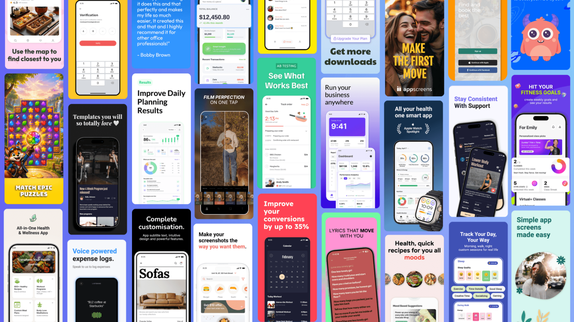
That quick judgment is exactly why Google Play screenshots matter. They may look like simple previews, but for app teams they work more like a mini landing page. Before someone taps Install, screenshots have to explain what the app does, why it is different, and whether it feels like the right choice.
That is also why more developers are testing their screenshots instead of choosing the set that simply looks nicest.
Why screenshots matter before the download
Google Play is not just a place where users read about apps. It is where they compare them. Search for a budgeting app, habit tracker, VPN, photo editor, or weather app, and you will usually see several options that make similar promises. In that environment, screenshots become one of the fastest ways to understand the difference.
Google's own preview asset guidance says screenshots are used to show an app's capabilities, look and feel, and experience, and that they may appear throughout Google Play, including search and the homepage. In other words, these images are not hidden deep inside a listing. They can be part of the first impression before a user has committed to reading anything else.
For users, screenshots answer simple questions. What does the app actually do? Is the interface clear? Does it solve the problem I searched for? Does it look modern, safe, and easy enough to trust?
For developers, those same questions are conversion questions.
The mistake: choosing the prettiest screens
A common mistake is treating screenshots as a final design chore. The app is built, the bugs are fixed, the release notes are ready, and someone grabs a few polished screens from the app. The dashboard looks nice, the settings page is tidy, the profile screen is clean, so those go into the listing.
The problem is that a good-looking screen is not always a good selling screen.
A budgeting app might have a beautiful transaction list, but a first-time user may care more about the promise: “See where your money goes.” A fitness app might have a clean workout library, but the stronger message could be: “Follow a plan that adapts to your progress.” A notes app might show a neat list of notes, while the real value is: “Capture ideas before you forget them.”
Screenshots should not only show interface. They should explain value.
What app teams actually test
The interesting part is that app teams do not have to guess forever. Google Play offers Store Listing Experiments, which let developers run A/B tests on store listing graphics and localized text. Google recommends testing icons, videos, and screenshots, testing one asset at a time for clearer results, and running experiments for at least a week so weekday and weekend behavior are both represented.
For screenshots, that opens up several useful tests.
A developer might test whether the first image should focus on the app's main benefit or its most recognizable feature. They might test whether a short caption works better than a more detailed one. They might test a different order, moving the strongest proof point from screenshot four to screenshot two. They might test a localized version for users in a specific country, or compare a darker visual style against a brighter one.
These tests are not about tricking people into installing. They are about finding the clearest way to explain the app to the right users.
Why good screenshots can still lose
Some screenshots fail because they are ugly. Many fail because they are unclear.
Tiny captions are hard to read on a phone. Raw UI screenshots can lack context. A carousel can repeat the same point five times instead of telling a useful story. A developer may describe features while the user is looking for outcomes. “Custom filters” is a feature. “Find the photo you need in seconds” is a benefit.
There are also Google Play-specific details to consider. Google advises developers to show the actual in-app experience, avoid overloading screenshots with small text or distracting backgrounds, and localize graphic text where appropriate. That matters because a screenshot that works well in one language or market may not explain the app as clearly somewhere else.
The goal is not to make screenshots louder. The goal is to make them easier to understand.
The first few images need a story
Most people do not browse an app listing like a product manual. They scan. That means the first screenshots have to do more than look consistent. They have to work together.
A simple structure is:
Screenshot one: the core promise. What is the main reason this app exists?
Screenshot two: the proof. How does the app deliver that promise?
Screenshot three: the outcome or trust signal. What does the user get, avoid, save, improve, or understand?
For example, a VPN app might lead with “Browse safely on public Wi-Fi,” then show one-tap connection, then highlight fast server selection. A habit tracker might lead with “Build habits you can actually keep,” then show daily planning, then show progress over time. A photo editor might start with the finished result, then show the editing tools, then show easy sharing.
The point is to make the first few images feel like a short explanation, not a random gallery.
Testing beats internal opinions
Without testing, screenshot decisions often come down to taste. One person likes the version with bigger phones. Someone else prefers more text. A founder wants to show every feature. A designer wants cleaner visuals. A developer wants screenshots that accurately represent the product.
All of those opinions can be reasonable, but users decide differently from internal teams.
A test helps answer better questions. Do people understand the app faster when the caption is benefit-led? Does the first screenshot need to show the product in action? Does a localized screenshot improve confidence? Does the new order increase installs, or did it only look better in a design review?
Even a small improvement can matter if an app already has meaningful traffic. If hundreds or thousands of people are visiting a Play Store listing each month, the screenshot set is not a minor detail. It is part of the install funnel.
A practical workflow for Android developers
The simplest approach is to start with a hypothesis. For example: “Users do not understand the app quickly enough,” or “The first screenshot is too feature-focused,” or “Our screenshots are not clear in our second-largest market.”
From there, change one meaningful thing. Rewrite the first caption from a feature into a benefit. Move the most compelling screenshot earlier. Create a localized set for one priority language. Reduce small text. Make the visual hierarchy clearer. Then test the change rather than rebuilding the entire listing based on opinion.
If a team needs to create several polished variants quickly, a Google Play screenshot generator from AppScreens can help turn raw UI captures into store-ready sets without rebuilding every design from scratch.
The bigger lesson is that screenshots should be treated like part of the product launch, not a leftover task after development is done. The same care that goes into onboarding, pricing, performance, and reviews should also go into the first images a user sees before installing.
The screenshot is part of the product experience
For Android users, this is why some app listings feel instantly convincing while others feel vague. You may not think about the screenshots for long, but they influence whether an app feels useful enough to try.
For developers, the takeaway is even clearer. Google Play screenshots are not just proof that the app has an interface. They are one of the first explanations of the product. When they are clear, tested, localized where needed, and focused on benefits, they can make the difference between a visitor who scrolls past and a user who taps Install.