


If you thought Android's blurry backgrounds and translucent panels were here to stay—well, hang on to your retinas: Android 17 is doubling down on these infamous visual effects, whether users like it or not. Is Google about to spark the next great mobile interface debate?
From a Major Overhaul to a Continuation
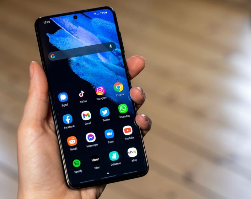
Remember Android 16? Last year, it brought a huge redesign to the Android interface with the introduction of Material 3 Expressive. One of the most talked-about features was the arrival of blur effects, especially noticeable in notification panels and quick settings.
Google explained its approach as aiming to “subtly blur the background to create a sense of depth, so animations feel light and you stay aware of the apps running in the background.” However, it's safe to say this wasn’t everyone’s cup of tea. If those blurry visuals already annoy you, here’s some bad news: Android 17, codenamed Cinnamon Bun, is set to carry on the trend—and it might even ramp things up a notch.
What to Expect with Android 17
The latest update is expected to roll out in June, bringing along several anticipated features—some of them already leaked. There’s good news in the mix, like built-in app locking and the much-awaited return of a previously retired shortcut. But, as you might have guessed, other changes could have users gritting their teeth.
According to reports from 9to5Google, system indicators suggest that Android 17 will introduce even more blur under the aptly named style “blur.” The aim is twofold: to let users guess what's behind each interface layer, and at the same time, to prevent background elements from becoming visual distractions.
Blur Everywhere (Well, Almost)
One example stands out: the Android 17 volume bar. Expect it to show up with a translucent look, allowing you to glimpse both your wallpaper and home screen apps, as well as whatever's running behind in other apps. It’s worth pointing out two key details:
- These blur effects will be tinted according to your own dynamic color theme.
- For now, the blur won't affect your apps; it’s just for the system interface.
Still, not everyone is thrilled. For some users, blur reduces readability and causes accessibility headaches. Thankfully, Google’s take on blur is subtler than Apple’s often-criticized Liquid Glass effect. Crucially, there is a workaround if the softness hurts your eyes or your workflow: you can turn off blur effects by navigating to Settings > Accessibility > Color and motion.
For the Record: Data and Privacy
In other news, personal data will also be used for advertising and marketing purposes within the Figaro Group and its commercial partners, for users who opt into these features. When you register, your email may be processed to offer personalized ads and content. But rest assured, you can object to this processing at any time.
Generally speaking, you have the right to access and correct your personal data, and even request its deletion—within the limits set by law, of course.


Wow, what a ginormous nothing burger! Slow day in the Android tech world?
Thank goodness Samsung’s UI doesn’t follow Google’s increasingly ugly design practices.