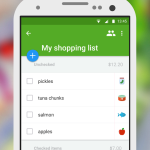




Listonic is a smart shopping list application available on both Android and iOS. The Android version of the application underwent a big update this week bringing an all-new design layout.
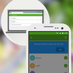
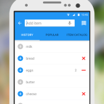
If you check your downloaded apps that are eligible to update, there's a good chance Listonic is one them. The newest version of the application contains a design overhaul that matches Google's Material design standards. We're seeing the shift to Material design across a number of apps in the marketplace. Listonic is now more organized, contains brighter colors and has quick shortcuts embedded throughout the interface. You'll also notice that some icons have changed to match that of Google's design standard. Additionally, a bevy of new animations can be noticed throughout the application which are now cleaner and faster.