




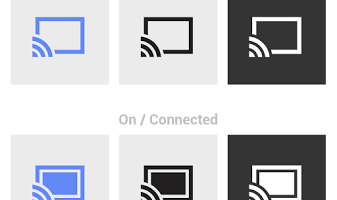
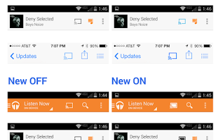
Leon Nicholls with the Google Chromecast team has announced a small, yet potentially useful, change to the Cast icon used by developers in their apps. Until now, when a user changed their app so that it was casting to a device, the only indication on their mobile device was a change in color of the Cast icon. This could be a challenge to pick up depending on what kind of background the icon was set against. Google has changed things a bit so that the icon will now show up with a solid fill when an app is casting.
The new design will be better for apps that are monochromatic or have limited colors available. In fact, Google's new guidelines no longer require a change in the color of the icon and make that optional for developers. Nicholls indicates image resources for the new icons will roll out in the next update to the Media Router Support Library. New, updated PSD templates with editable vectors are available now for developers who use a custom Cast icon in their app.
source: +Leon Nicholls
