


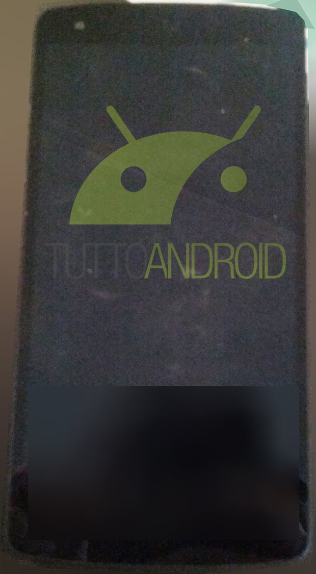
We've seen the Nexus 5 leak multiple times, usually around the same time we've seen Android 4.4 interface leaks. Today, though, we're getting what is probably the best look yet at both the phone and the newest version of Android 4.4 KitKat. Thanks to TuttoAndroid, who was also responsible for some of the earlier leaks of Android 4.4, we've got a clean look at the front of the Nexus 5, as well as different aspects of the slightly redone interface that we're going to see on the Nexus 5. The leaked picture of the Nexus 5 matches up with what we've seen in previous pictures and renders.
The interface in Android 4.4 also matches up with many of the leaks we've previously seen. The status bar still shows a transparency effect, and most of the status bar icons have adopted a clean white look instead of the Holo blue. The lockscreen is also seeing some slight improvements, with a camera icon in the bottom right that you can swipe to open the camera app. You can still slide the lock screen over to access the camera app as usual, but this small indicator is a nice user tip for the less savvy users.
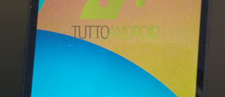
The navigation bar has also picked up a transparent effect like what we've seen other manufacturers do with some phones (Moto X, LG G2). The home screens are also slightly different, with a slightly transparent app drawer icon, as well as a different icon for the phone app. The app drawer now has a transparent background instead of plain black, and there is no longer a widget tab in the app drawer.
It's worth noting that the messaging app and gallery app seem to have disappeared. There's a Google Photos app present, which probably congregates all of your photos together. There's no messaging replacement app that's available to see, but Google Hangouts is present, so we may see that SMS/MMS integration happen after all.
You can check out the pictures for yourself below. Hopefully we'll get to see Android 4.4 and the Nexus 5 in action by the end of the month.

source: TuttoAndroid
Interesting new font for icon text.
Like a lot of seasoned Android users personally the front end is of very little consequence & were all eagerly awaiting to see what’s been done behind that rather familiar design to either add features or improve/enhance the Android experience & that’s the itch I really so desperately need scratching. But thanks for the pics I did notice that the of white/grey signal bars previously mentioned show up on the lock screen directly & not on the notification bar in the pics or maybe the notification bar has been made transparent (or maybe a custom rom mod)