


![]()
Newer versions of the Samsung Galaxy S6 Edge will feature a slightly redesigned Samsung logo. It seems that the Korean tech giant has opted for a highlighted design over its standard logo.
As you can imagine, the change seems most drastic on gold variants of the Galaxy S6 Edge. While the change certainly isn't drastic, SamMobile says it reflects light differently than the standard logo. I personally enjoy the older branding over the new highlighted design. It almost looks like a cheap sticker.
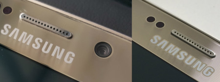
I do wonder if this is just a change to the gold version of the device, all Galaxy S6 Edge models or a transition Samsung is making as a company.
What do you think of the new highlighted branding? Have you seen it on any other devices other than the Galaxy S6 Edge? Be sure to let us know in the comments.
source: SamMobile
I bought the gold s6 edge the day it was available (April 17) and I have the logo which is now supposed to be new…